Developing brand strategy and identity for a small business
Problem
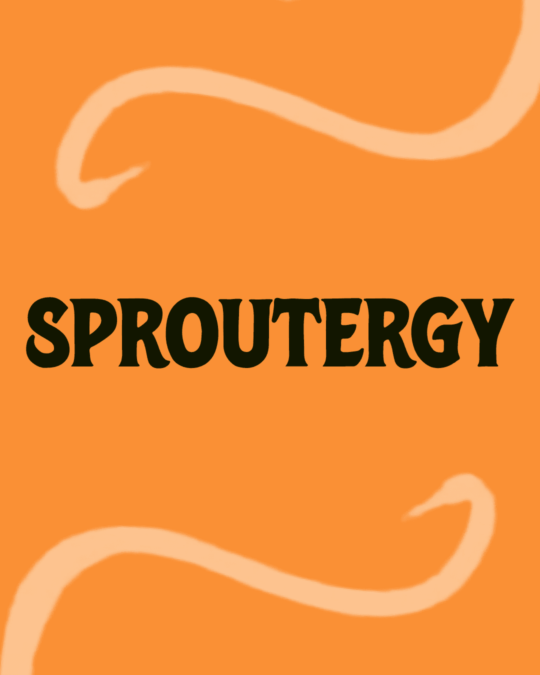
Sproutergy has a great product but is missing the strategic brand foundation to launch successfully
Results
Strategic guidelines and brand identity
Timeline
24-hour Design Hackathon
My Role
Brand Design
Team
me (Designer)
Lucas Carbone (Designer)
Kitty Tsang (Brand Strategist)

Sproutergy is a small business with a consumable product that is preparing to go into market. They use a proprietary ingredient (sprouted wheat powder) to make products, like protein bars, that can help reduce muscle soreness, cramps and speed up muscle recovery.
Sproutergy already has:
✅ Patent-Pending Natural Proprietary Product
✅ Science/Research Credibility
✅ Positive Feedback/Results
But it's missing the strategic brand foundation to launch successfully.
⚠️ No Clear Positioning
What makes Sproutergy different from protein bars, recovery drinks, or supplements? Without positioning, they'll get lost in the crowded wellness market.
⚠️ No Target Audience Selected
Sproutergy has an unclear Ideal Customer Profile, which leads to unclear direction for branding and messaging.
⚠️ No cohesive brand identity
Sproutergy has mixed feelings about its existing logo variations.
Sproutergy uses a proprietary ingredient: sprouted wheat powder to produce consumable products such as protein bars, flavored powder, and caffeine-free drinks that can help reduce muscle soreness, muscle cramps (including menstrual cramps) and speed up muscle recovery.
The client created the logos below, but are not attached to either option.


Sproutergy sits at the intersection of performance, wellness, and nutrition as a natural, recovery product.

Audience Prioritization: We focused on fitness enthusiasts as our primary audience because of its high product market fit
Positioning statement
Brand identity: My concept
Our team explored two distinct brand identities. My concept focused on the brand's wellness and nutrition focus, emphasizing healing and natural elements, and recovery.

This moodboard helps guide the brand’s visual direction.
Warm, earthy tones to evoke healing, calm, and trust
Rounded top corners to soften the aesthetic and reference the design of seed packets
Organic elements (wheat, hand-drawn florals) to emphasize nourishment and natural movement
Water symbolizes healing and restoration


Packaging


Packaging for different flavors